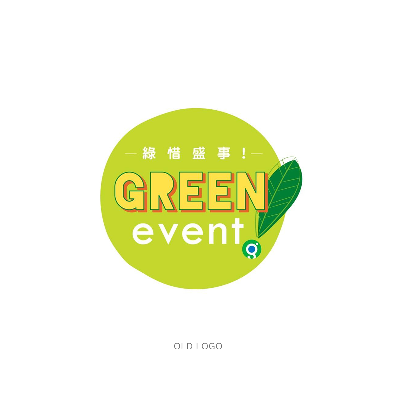
As part of the logo renewal, we had 3 tasks to complete, make it look sharp and clean, maintain The Green Earth’s signature, and avoild any significant changes.
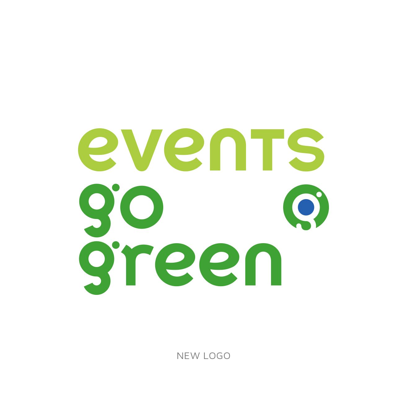
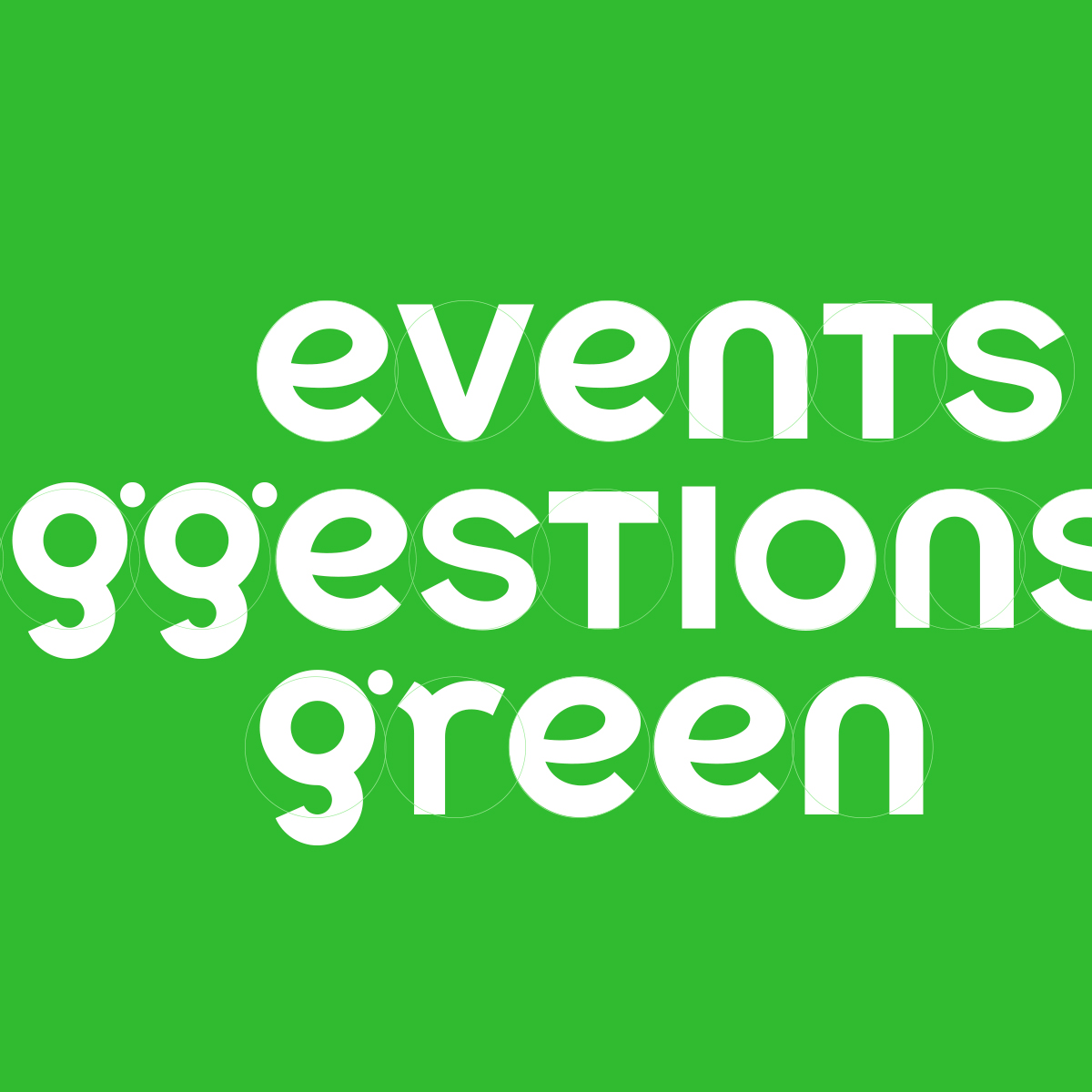
To enhance the logo’s usability, we extracted the logo name from the circle so that the size of the logo can be reduced while keeping visibility. We designed the logotype using the 'g' from The Green Earth logo and developed the remaining letters.
In addition to the ‘g’ structure, we used the circle from the original logo as the font’s structural gird lines to unify and enhance logo’s uniqueness.
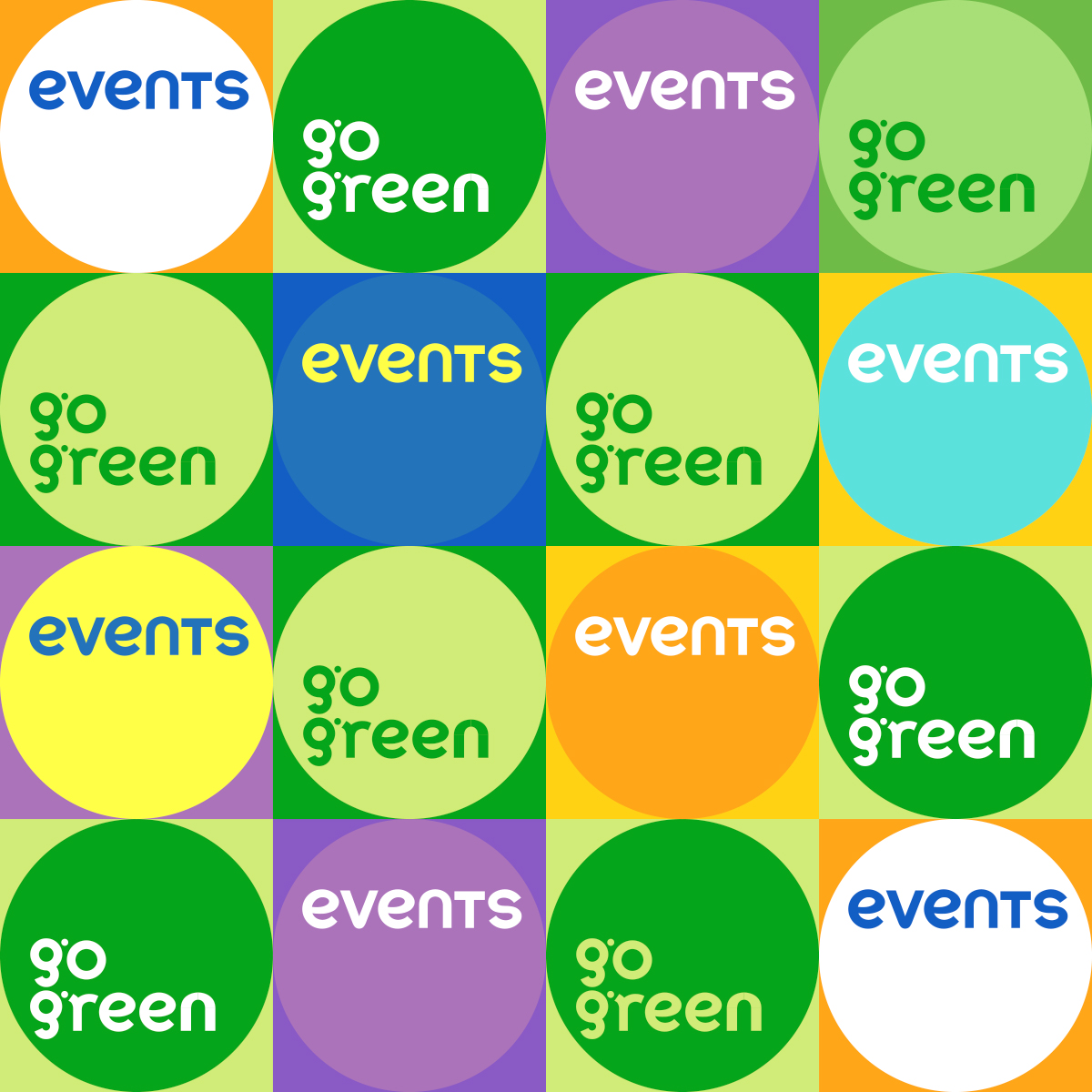
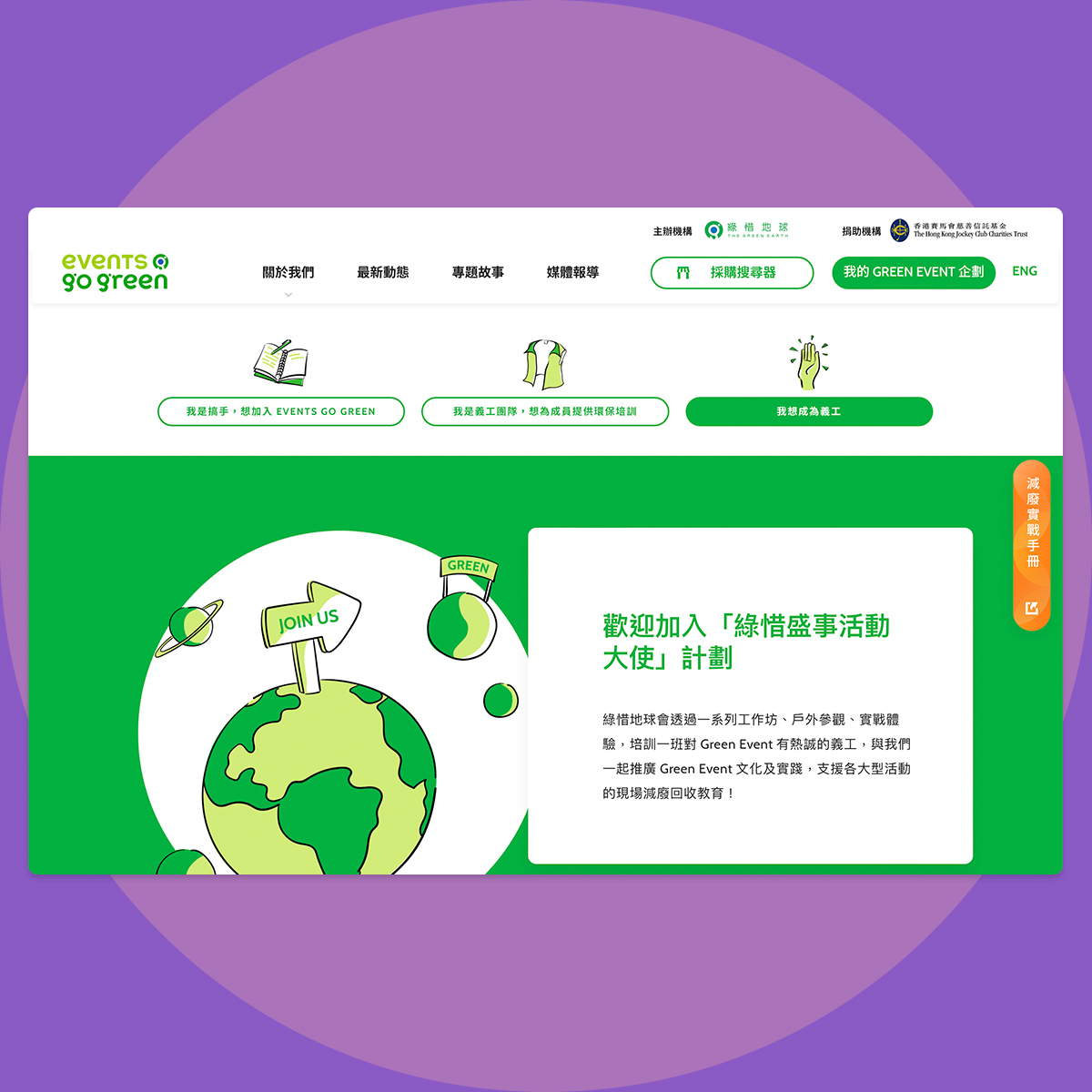
Every events can 'Go Green'
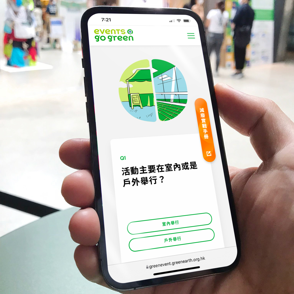
The circle is one of the key elements of the identity, and we incorporated the ‘flipping’ concept into the logo. This means that every event, no matter its color or theme, can flip to green. We applied this cancept to the website’s heading banners.
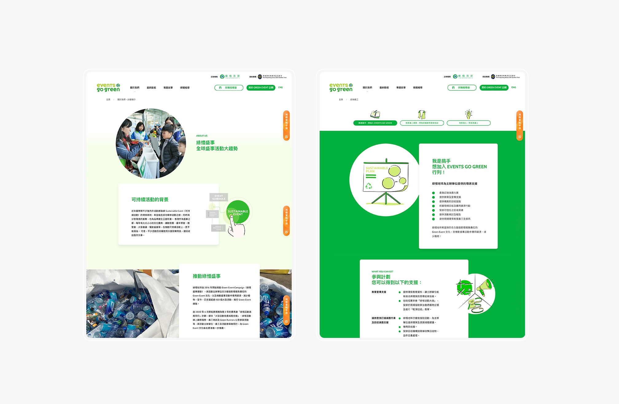
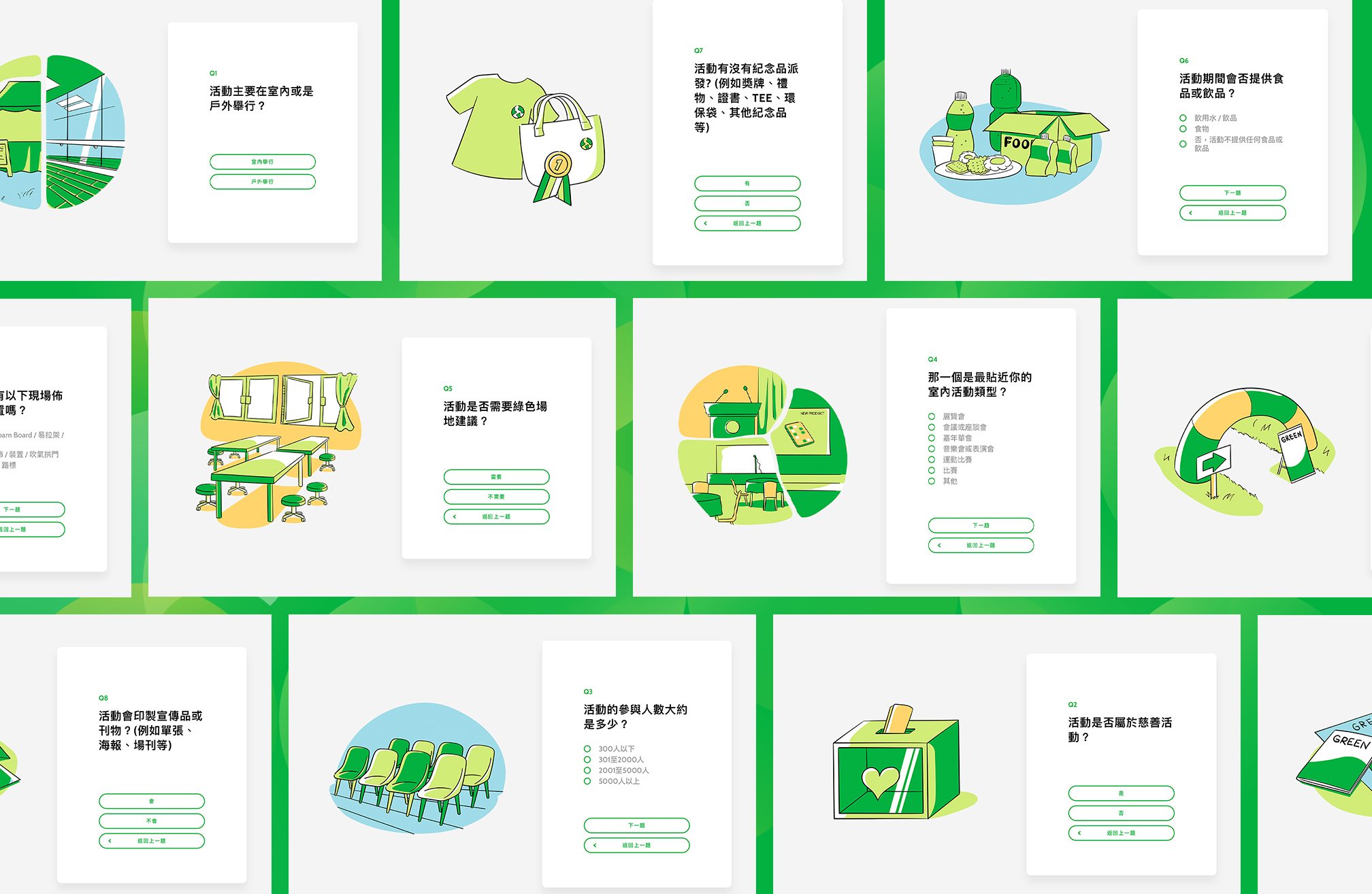
‘Events Go Green’ aims to assist potential event planners in organising environmental friendly events. To improve efficiency, we designed an online consultation platform called ‘Green Suggestions’. This platform allows applicants or event planners to receive a suggestion report after completing an online questionnaire. Colleagues from The Green Earth can collect the applications at anytime and follow up with the applicants.